Monday, December 13, 2010

Complex Visual


We wanted to make a semester encompassing visual that demonstrated the
majority of topics we learned about this semester, such that it could
be understood by someone who did not take the class. We created a
persona of a typical Roger Williams student entering the
Communications major. Our choice of visual was a flow chart because of
its easy read and it was the easiest way to show the majority of
information without having a convoluted graphic. We used different
colors matching with the different shapes within the chart so that
questions, terminators and actions were easily distinguished.
The chart started with the choice of graphic, moving on to the
decisions of color, shape and size, finally ending with the breakdown
of Schriver’s Model. The front side of our visual represents the
thoughts of our persona, Axel. When creating our flow chart we broke
up the sections between us to gain a greater insight on what we were
graphing. Shean dealt with determining the graphical visualization,
Marybeth covered colors, shapes and sizes, and Brittany mapped out
Schriver’s Model. We decided on these three subjects because they were
key in our own processes in making our other visualizations throughout
the semester. As opposed to trying to market a broad audience, we
decided to make our target audience more succinct by creating the
persona, Axel. The front side of the flow chart represents the
thoughts of our persona in the form of a mind map. This was in the
hopes of giving our classmates an exact idea of who we are targeting
in our graphic. We all felt that the flow chart was the best way to
get the information across concisely. We also agreed on the mind map
because it was a great contrast to the rigid structure of the flow
chart.

In creating this visual I found it interesting to combine the materials we
had learned while trying to teach it to an audience. I found it very useful
that we created a specific persona rather than a broad market. The use of
a mind map and flow chart made it easier to encompass more about the
visual aspects. I found that it was difficult at times to display all of the
information in question form for the flow chart. The project brought together
much of the information we covered in class and demonstrated it as well.
The use of the words along with the images incorporated the dual coding
theory as well. The complex visual created made me realize how much
detail has to be thought of before and while creating it to make it an efficient
visual.

Wednesday, December 8, 2010

Multivariate Display


In creating this multivariate display I was trying to determine which popular coffee shops around campus have the lowest pricing. I chose Dunkin Donuts, Starbucks, and Sip n Dip because those seem to be most common among students on campus.  Since each shop has many different items for sale I decided to pick three of the same type and size to compare. By doing this I got more information about the overall companies than if I compared just one item as well as narrowed it down to items that are as close to each other as possible. In creating the visual I realized that the bar graph with each item and each company was useful because it broke down the information for the audience. The combining of the information into three columns of the companies was more useful in getting across the message of pricing per store. I realized in creating this visual that there could be many ways to display the same information, some getting across the same message and some focusing on something else. This was an “AHA” moment for me when I realized that the message sent to a viewer using a graph is heavily reliable on the visual representation of the data and not just the data alone. In looking at my data I also realized that people chose coffee beyond pricing. The three I chose are basically of equal accessibility to students meaning that taste, quality, or other factors play a role in purchasing coffee otherwise the majority of people would go to Sip n Dip. Using the same data people can display very different messages using graphs in a certain way. For example, with the data I collected I was comparing the companies’ pricing but with the same information someone else could use a graph to display the pricing of coffee and hot chocolate. There has to be planning and thought behind graphs to send the viewer the message you want them to receive.

Tuesday, November 30, 2010

Storyboard


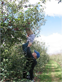
The Fall field trip this year was to the local apple picking farm. All of the children got on the school bus and headed to the farm.


The farm was large but the kids were allowed to go off on their own and try to gather up as many apples as they could.  


Sarah found some good apples but as she was walking back she saw what she thought was the best apple. She couldn't figure out how to get it though because it was too high up.


Then she saw her teacher Mr. Thompson helping her classmate reach an apple. Sarah was thrilled she would be able to get to her apple and go home with the best apple she's ever seen.


Part 2


In the build of the city an explosion went off and the building began to suddenly collapse.


The rescue teams went to the scene immediately to assist people in evacuating.


People in range of the ash and smoke were given masks and escorted out of the rubble to a safer location.


As people came out of the ash filled streets a man began praying, hoping one of the figures would be his wife who worked in the building.


In creating the storyboard visuals I was trying to give the viewer a complete understanding of the story that took place using photos and some text. The storyboard is similar to a comic in many ways because of the separate images that the reader fills in information in their mind between screens. I was trying to find images that didn't create too large of a gap between subjects but was not repetitive either. In the first storyboard I chose the girl with the apple and created a story about apple picking. This was a lighter story that relied more on the text than in the second. While creating the second storyboard I was more selective in my images because I noticed in the first one, it would've been difficult to understand the story completely without the text. I picked images that were more of a step-by-step format than jumping to a complete new scene or situation. My "AHA" moment came when I was searching for the actual images to use. I had the basic thought of what I wanted but when it came to picking a single image, I realized that little details are important. The image has to best represent the idea I was trying to get across, while leaving the least amount of room for the viewer to be confused. I also realized how powerful storyboards can be. The photos and short descriptions leave space for the viewer to connect and use their imagination. If it were a film or book, the viewer would be told more directly what to think. The text seems to reduce the cognitive load but the main story should still be understood by looking at just the images. In storyboards audiences can look at the same one and get the same main idea but still have their own views to what took place. The first storyboard uses a scene-to-scene transition. Each frame brings the viewer to the next scene in the story. The second storyboard goes from action-to-action. Each frame brings the viewer to the resulting action of the frame before it.


Monday, November 22, 2010

Table to Graphic


In creating the table and charts I was trying to make a good visual representation of data. The data chosen was the percentage of students according to racial make up, of Roger Williams University. The races included American Indian, Asian, Black, Hispanic, White, and Unreported. To begin the visual I used Microsoft Excel and created a table of information. The table is easily read using the gray highlights and color fill behind titles. The data was plugged in and Excel verified the total was equal to one hundred percent. Then I inserted different style charts and graphs by using the table data and placing them in the spreadsheet. Excel makes it easy to focus on the visual aspects rather than the data, once the table is created. The program offers different styles of which I choose four; exploded pie, bar, donut, and 3-D pie. With in the templates they have set up I was also able to choose colors and placing of information within the chart. I found the pie or exploded pie charts to be the best for the information I was trying to display. Since the information was out of one hundred percent, viewers already know when looking at the circle that the races all add up. When creating the visual I found that the visual was good but the race “unreported” group was twenty-three percent, leaving for a large piece of the population unknown. Color is an essential part of the chart. With some of the smaller populations the colors are what create the visual separation rather than the space. I think never realized how many ways there were to show the same information about something. In creating these visuals I saw how the effectiveness of a presentation or something someone is trying to communicate can have very different impacts depending on the style chosen.


Thursday, November 11, 2010

Flow Chart


The purpose of creating the flow chart was to make the process of purchasing a book on Amazon.com simple and understandable. The commonly recognized symbols were used in the flow chart for different types of steps such as decisions, processes, and terminator. These symbols aid in the organization of events. The flow chart created a guide for an audience to follow step by step. While creating the flow chart I realized how much goes into the thought and process of purchasing a book online without even realizing it. It seems so simple when doing so but then when I was creating the flow chart I realized there were more steps than I thought. Amazon does well visually organizing and displaying their information in a way that creates less work for the audience to find what they are looking for. The flow chart made me think of the process differently because circumstances had to be formed into questions. In making things into questions I found that there were more questions to be asked then I thought of at first. A flow chart is a very useful visual when describing a process to someone. It is easy to follow because questions are answered with either a “yes” or a “no” making the reader pick one of two options as suppose to several options. Then following the answer brings you to one more item, not a variety. Then after following all of the steps there is an endpoint that is clearly reached. The endpoint using a separate symbol gives a reaction right away that the process is over. With the process of buying the book it doesn’t matter which route the reader has to take, at the end they are still purchasing the book.

Explanation Graphic

Original Visual

Original: Link
1st: Top
Final: Bottom

In creating these explanation visuals for the paper I was attempting to make simpler and easier to understand instructions on how to build a snowman. While creating the visuals I realized how difficult it is to display detail of actions to an audience using images more than words. There are so many different aspects that have to be considered when thinking about the different ways the message could be read. I also realized to get the most out of the instructions there was a need for both words and images combined rather than one or the other.

Tuesday, November 2, 2010

"How To" Visual


In creating this "how to" visual I was trying to effectively communicate a process to someone without the use of words.  The goal was to clearly describe how to make a spaghetti dinner. I began with using common symbols for the materials and ingredients needed. For the spaghetti I used a common colored blue box with a window. Instead of trying to come up with a common label for the sauce I used an icon of a tomato and red jar. Pots and pans can look very similar so I used different shapes and handles to make it easier for the audience to distinguish between them. I used a stove to how to cook the pasta. I thought this would also help if the background, the stove, remained the same because it would be easier to follow the changes. To show the order of events I used green arrows. For the time involved in waiting for the pasta to cook I drew the symbol of a stop sign along with change in time on clocks. It was difficult to show order when thinking about how differently cultures are use to reading. While making the diagram I had my “AHA” moment when I found myself constantly trying to use words. I didn’t realized how heavily I relied on written instructions when following a process to do something. At the same time I rely on images to clarify things for me. The combination of words and images makes things much more clear rather than using one or the other. “How to make a spaghetti dinner” seems like a simple thing to describe, but when using a visual without words I realized how many little steps there are that can be difficult to show through words. Visuals have to be very carefully created to reach audiences in an effective manner.